一、前言
项目中有一个同事遇到了一个吸顶效果的需求,于是帮助他完成的同时顺便分析下position:sticky。
二、position:sticky是什么
粘性定位元素(stickily positioned element):粘性定位可以被认为是相对定位和固定定位的混合。元素在跨越特定阈值前为相对定位,之后为固定定位。
最白话来说,其实这句话想表达的是: 粘性定位(position:sticky) = 相对定位(position:relative) + 固定定位 (position:fixed)
三、position:sticky作用以及兼容
1. 作用:
其作用为了在iOS下实现吸顶效果,原先吸顶效果的基本的开发思路如下:
利用scroll事件进行监听scrollTop的值,当scrollTop达到一定的值得时候设置吸顶元素的position : fixed;属性。
但是问题是:安卓支持scroll事件和fixed属性,但是ios8.0的scroll事件不是连续触发的,只会在scroll事件结束后触发一次scroll事件,同时ios下fixed属性的支持一直是个问题。
2. 兼容性探究:
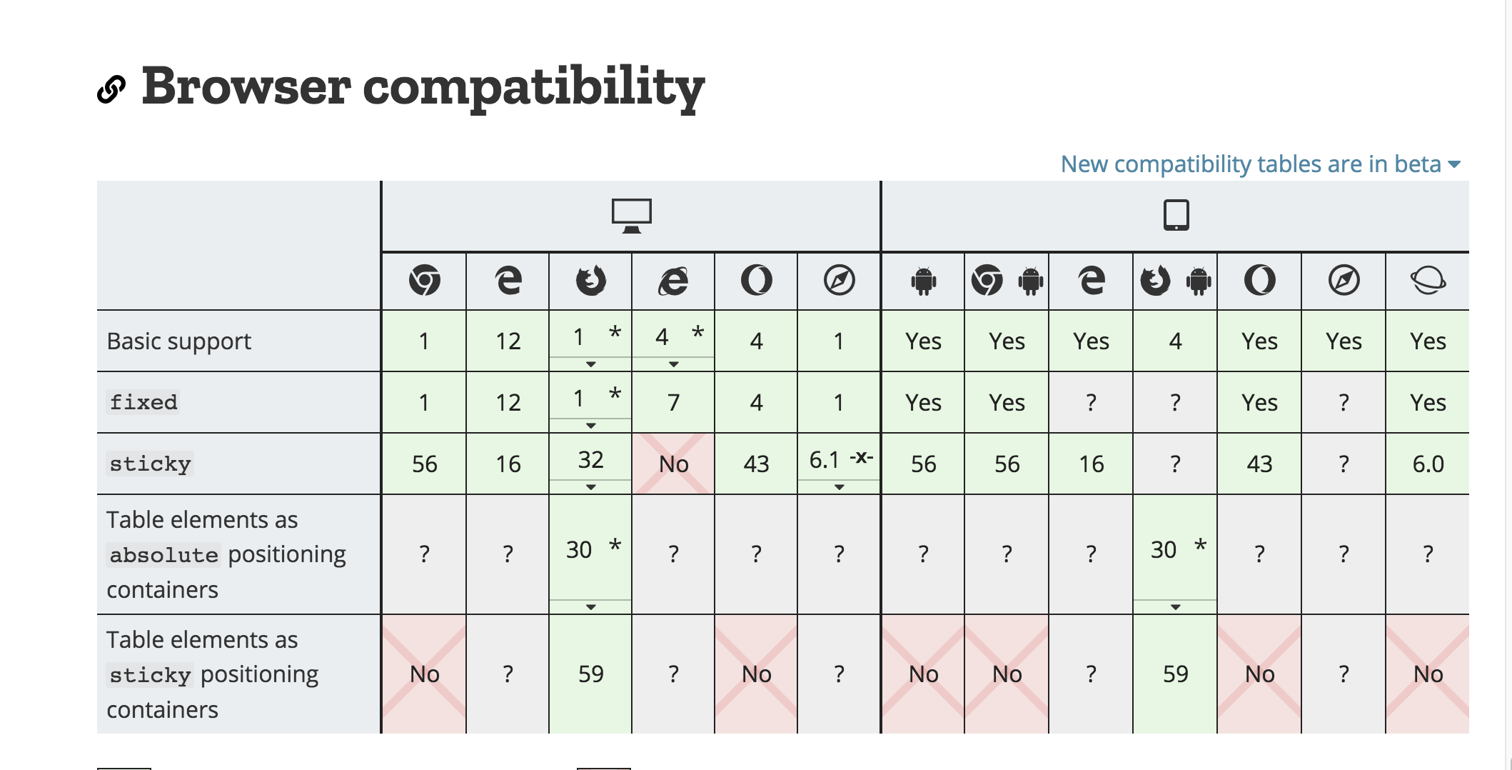
####( 3) 因为mdn以及caniuse给到的兼容性并不一致,同时如上面所述主要在iOS使用,因此实际使用仍需要对iOS机型进行实际测试,并考虑polyfill方案
之后在实际找到设备测试后,会持续更新
(4) polyfill方案:
https://github.com/wilddeer/stickyfill
三、position:sticky触发条件
1、具有sticky属性的元素,其父级高度必须大于sticky元素的高度。
2、sticky元素的底部,不能和父级底部重叠。(这条不好表述,文后详细说明)
3、sticky元素的父级不能含有overflow:hidden 和 overflow:auto 属性 (不包括祖先,仅直接包含的父容器)
4、必须具有top,或 bottom 属性。
四、移动端吸顶效果实战
1.position:sticky
使用position:sticky 一定要记得处理浏览器兼容,并且指定top或bottom
1
2
3
4
5
| .sticky {
position: -webkit-sticky;
position: sticky;
top: 0;
}
|
2.实战
1
2
3
4
5
6
7
8
9
10
11
12
13
14
15
16
17
18
19
20
21
22
23
24
25
26
27
28
29
30
31
32
33
34
35
36
37
38
39
40
41
42
43
44
45
46
47
48
49
50
51
52
53
54
55
56
57
58
59
60
61
62
63
64
65
66
67
68
69
70
71
72
73
74
75
76
77
78
79
80
81
82
83
84
85
86
87
88
89
90
91
92
93
94
95
96
97
98
99
100
101
102
103
104
105
106
107
108
109
110
111
112
113
114
115
| <!doctype html>
<html lang="en">
<head>
<meta charset="UTF-8">
<meta name="viewport" content="width=device-width, initial-scale=1, shrink-to-fit=no, user-scalable=no">
<meta http-equiv="X-UA-Compatible" content="ie=edge">
<script>
(function (doc, win) {
var docEl = doc.documentElement,
resizeEvt = 'orientationchange' in window ? 'orientationchange' : 'resize',
recalc = function () {
var clientWidth = docEl.clientWidth;
if (!clientWidth) return;
docEl.style.fontSize = 75 * (clientWidth / 750) + 'px';
};
if (doc.addEventListener) {
win.addEventListener(resizeEvt, recalc, false);
doc.addEventListener('DOMContentLoaded', recalc, false);
}
})(document, window);
</script>
<title>Document</title>
</head>
<style>
* {
margin: 0;
padding: 0;
}
.container {
position: fixed;
overflow: auto;
width: 100%;
height: 100%;
}
.banner {
height: 2rem;
background-color: #009EE0;
}
.sticky {
  position: -webkit-sticky;
  position: sticky;
  top: 0;
}
.fixed {
position: fixed;
width: 100%;
top: 0;
left: 0;
background-color: white;
}
.relative {
background-color: white;
}
.sticky-title {
height: 1.4rem;
background-color: pink;
}
.sticky-content {
height: 20.3rem;
overflow: auto;
}
</style>
<body>
<div class="container" id="container">
<div class="banner">
Banner部分
</div>
<div id="sticky">
<div class="sticky-title">吸顶结构标题。。。</div>
<div class="sticky-content">
<div>内容块</div>
<div>内容块</div>
<div>内容块</div>
<div>内容块</div>
<div>内容块</div>
<div>内容块</div>
<div>内容块</div>
<div>内容块</div>
<div>内容块</div>
<div>内容块</div>
<div>内容块</div>
<div>内容块</div>
<div>内容块</div>
<div>内容块</div>
<div>内容块</div>
<div>内容块</div>
<div>内容块</div>
</div>
</div>
</div>
</body>
<script>
var scrollWrapper = document.getElementById('container');
var stickyDom = document.getElementById('sticky');
const u = navigator.userAgent;
const isAndroid = u.indexOf('Android') > -1 || u.indexOf('Adr') > -1;
const isiOS = !!u.match(/\(i[^;]+;( U;)? CPU.+Mac OS X/);
scrollWrapper.addEventListener('scroll',function() {
if (isAndroid) {
var bannerHeight = document.getElementsByClassName('banner')[0].clientHeight;
if (this.scrollTop > 72) {
stickyDom.className = 'fixed';
}
} else if(isiOS && (CSS.supports("position", "sticky") || CSS.supports("position", "-webkit-sticky"))){
stickyDom.className = 'stickay';
}
});
</script>
</html>
|